
It’s been awhile since I wrote about how to build multicolumn forms in Pardot using Bootstrap v4, and since then Bootstrap has moved onto v5. So I figured it was about time for a refresh.
Simply replacing the Bootstrap stylesheet with the v5 version immediately breaks the layout of the form. There are not a lot of changes to make, but they are essential.
Additionally, I used jQuery to add the bootstrap classes to the input, so I was able to strip out much of the styling.
In the interest of not being like a food blog, I am going to give you the full code snippets first, and then if you care to learn, I will have some details below.
Quick Setup Guide
The following two snippets of code will go in a Layout Template under Content in Pardot.
⚠️ Important first step: Uncheck “Include default CSS stylesheet (recommended)” on the layout tab. Forgetting to uncheck this will frequently cause issues that you will spend too much time trying to resolve.
Layout Tab Code
<!DOCTYPE html>
<html>
<head>
    <meta charset="utf-8">
    <meta name="viewport" content="width=device-width, initial-scale=1">
    <title>%%title%%</title>
    <link href="https://cdn.jsdelivr.net/npm/bootstrap@5.2.2/dist/css/bootstrap.min.css" rel="stylesheet" integrity="sha384-Zenh87qX5JnK2Jl0vWa8Ck2rdkQ2Bzep5IDxbcnCeuOxjzrPF/et3URy9Bv1WTRi" crossorigin="anonymous">
    <script src="https://code.jquery.com/jquery-3.6.0.min.js"></script>
</head>
<body>
    <div class="container">
        <div class="row justify-content-center">
            <div class="col-md-8">
                %%form%%
            </div>
        </div>
    </div>
</body>
</html>
Form Tab Code
<div class="mb-3">%%description%%</div>
%%form_errors%%
<div class="row">
    %%form_fields%%
</div>
<div class="row">
    <div class="col-12">
        <div class="d-grid">
            %%submit_button%%
        </div>
    </div>
</div>

<script type="text/javascript">
   $(document).ready(function () {
      $('input[type=text],textarea').addClass('form-control');
      $('select').addClass('form-select');
      $('input[type=checkbox],input[type=radio]').addClass('form-check-input');
      $('.pd-checkbox,.pd-radio').addClass('form-check');
    });
</script>

<style>
.form-check-input {
    margin-top: 0.125em;
}
.pd-checkbox, .pd-radio {
    margin-bottom: 0.5rem;
}
</style>
The above form uses btn-danger to give me a red button. Other button colors can be found in the Bootstrap documentation.
Creating Multi-Column Forms
Now that the layout is created, you can create forms. Forms can have as many columns as you want, as long as the width of the columns add up to 12. Here is an example that has 1, 2, and 3 fields across.
⚠️ Important note: If a field is going to be less than the entire width of the form, you should choose to “always display even if previously completed”, or you risk breaking the configuration that you want.
Setting Column Widths
Under the Fields tab, choose the Advanced tab. This is where we add the width of the column to the CSS Class:
col-6- Half width (2 columns)col-4- One-third width (3 columns)col-12- Full width (1 column)col-12 col-md-6- Full width on mobile, half width on desktop
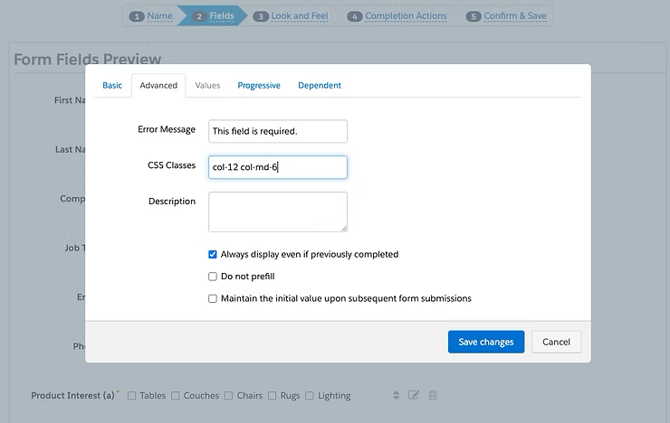
Feel free to expand and shrink this example to see what happens with different breakpoints!
Form Styling
Next, on the Look and Feel section of the Form build, the only style you should touch is the Required Field Character. I changed this to the *. You can also target the style of your required field character with CSS styles.
What Changed from Bootstrap v4?
1. jQuery for Automatic Class Assignment
I added jQuery to the header of the Layout tab to make it easy to add classes to the input elements. The biggest struggle in customizing a Pardot form is that the input fields are completely generated by code, so it is not possible to manually add in the classes that Bootstrap uses.
However, you can use jQuery to target the specific input fields and add classes to them:
$(document).ready(function () {
   $('input[type=text],textarea').addClass('form-control');
   $('select').addClass('form-select');
   $('input[type=checkbox],input[type=radio]').addClass('form-check-input');
   $('.pd-checkbox,.pd-radio').addClass('form-check');
});
2. Simplified CSS
This jQuery approach allowed me to remove most of the CSS I had to add in my first version. I still had to include a couple CSS element selectors for checkboxes and radios, which were just being cranky and uncooperative.
3. Updated Bootstrap Structure
Finally, I:
- Removed the
form-rowdiv - Removed the
form-groupclass from the Form tab - Changed the class of the div surrounding the Submit button to fall in line with the newer Bootstrap form model
Benefits of This Approach
These updates both bring your forms up to date with Bootstrap v5, and as a bonus do a better job fixing the styles of:
✅ Textarea fields
✅ Select dropdown fields
✅ Checkbox fields
✅ Radio button fields
The result is cleaner, more maintainable code that automatically applies proper Bootstrap styling to all your form elements without manual CSS overrides.
Example Form Layout
Here’s what you can achieve with this setup:
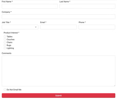
Row 1: Full-width field (col-12)
Row 2: Two half-width fields (col-6 each)
Row 3: Three equal-width fields (col-4 each)
This approach gives you complete control over your form layouts while maintaining mobile responsiveness and accessibility standards.